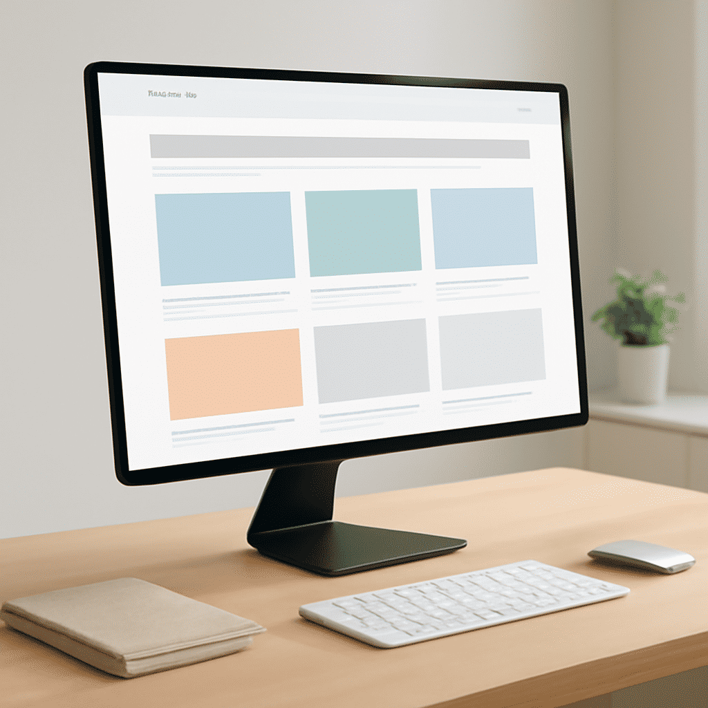
Creating effective website arrangements is essential to enhance user experience and accessibility. It involves blending visual aesthetics with functional design to guide visitors seamlessly through a site. Here, we explore several strategies to master these layouts, ensuring that users not only find what they are looking for but enjoy the journey.
Understand the Purpose and Audience
Before diving into the design process, it's crucial to understand the core purpose of the site and the audience it serves. Are you targeting tech-savvy professionals or creative artists? The answers to these questions will significantly influence the structure, color scheme, and typography you choose. Knowing your audience allows you to tailor an experience that resonates on a personal level, encouraging visitors to engage more deeply with your content.
Utilize a Grid System
A grid system is a fundamental tool that brings order and uniformity to page layouts. By dividing a page into columns and rows, a grid system creates a cohesive structure that aids visual flow. This structure helps users predict where to find information, reducing cognitive load and enhancing user experience.
Design for Ease of Navigation
Intuitive navigation is the cornerstone of a user-friendly interface. Users should be able to find information with minimal effort. Employ clear and concise labels for menus, utilize hover effects for interactive elements, and ensure that all navigation tools are easily accessible, no matter where users are on the page.
Prioritize Mobile Responsiveness
With the increasing use of smartphones and tablets, designing for mobile devices is non-negotiable. A responsive design ensures that a site functions well across various screen sizes. Consider touch screen capabilities and prioritize speed and performance to retain the attention of mobile users.
Use Visual Hierarchy Thoughtfully
Visual hierarchy involves arranging elements in a way that naturally draws the eye to the most important sections first. This can be achieved through the use of size, color, contrast, and placement. Headlines, calls to action, and key messages should be prominently featured to capture immediate attention and guide users through the content.
Embrace White Space
Often underestimated, white space—or negative space—is a powerful design element. It prevents a layout from feeling cluttered, allowing users to focus on specific elements without distraction. Adequate white space around text and images enhances readability and creates a more relaxed, engaging user experience.
Focus on Accessibility
Ensuring that a site is accessible to all users, including those with disabilities, is both a moral responsibility and a legal requirement in many regions. Utilize descriptive alt text for images, ensure adequate color contrast, and provide keyboard navigation support. These elements not only help comply with accessibility standards but also widen your audience reach.
Test and Optimize
Finally, testing your site with real users is an invaluable step in the design process. Gather feedback on navigation, readability, and overall satisfaction. Use this data to make informed adjustments and continuously improve the user experience. Regularly updating content and design to reflect current trends and user feedback ensures your site remains relevant and engaging.
In conclusion, mastering the art of page arrangements involves a delicate balance between aesthetic appeal and practical functionality. By focusing on the strategies outlined above, designers can create environments that are not only visually pleasing but also enhance the overall experience and satisfaction of users.